What to Wear for Family Portraits
The biggest piece of the pie…
Depending on who you ask, this tends to be either the most stressful or the most fun part of the whole process (although I'm SO here to help you). There are many photographers out there who have all kinds of different styles. I have a very specific style and strive to be consistent with my images so you know exactly what kinds of photos you will be getting from your session (dreamy, light, airy, classic, timeless, and glowy...)


Light colors and patterns:
Perhaps you've noticed that mostly everyone on my website or instagram feed is wearing light colors. There is a reason for this! A photographer's best friend is light. Light is my "paint," if you will. I use it to get a very specific look. When you wear light clothing, the sunlight bounces around, reflects back onto your face and anyone who is around you, creating a beautiful glow. It flatters your skin - making it creamier, and hiding flaws. It also helps create the overall aesthetic of the photo.
Another reason I highly recommend light colors is that sunlight combined with vivid colors (such as really bright blues, neon yellows, etc) will make for an unnatural color cast on your skin. With the use of natural (sunlight), if you are wearing bright green and it reflects back onto your face (...and it will....) it can make you look slightly sick and we don't want that! I want to make sure your skin looks vibrant, healthy, and true to color. My aim when it comes to clothing, is to have it NOT distract from your faces and expressions! I want the focus to be solely on those dimples in your baby's cheeks, your son's freckles, your daughter's beautiful brown eyes. When you are wearing simple and timeless clothing, the attention isn't drawn to your clothing... but to those amazing features I just mentioned. This is a great thing! When you wear busy patterns, it competes for that attention and your eyes are naturally drawn there.
The pattern “squint” test:
When in doubt about a pattern, do a "squint test" - just look at it, squint your eyes, and if the clothing item looks like a solid color or close to it, it's good to go! If it still looks pretty busy and patterns can be easily distinguished, it's better to go with a more delicate pattern.

NAH!
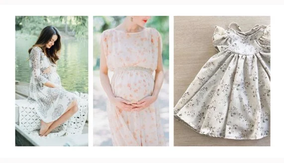
While adorable in person, these kinds of patterns don't photograph well with my style of photography. The areas of high contrast (aka: light and dark colors close together) attract the eye and compete for attention... taking the focus from faces. This is one of those seemingly little choices that actually make a big impact!
YEAH!
Light and delicate patterns are softer and easier on the eyes (and the overall color palette). If you squint at these you won't see too much that sticks out. Once again, this clothing doesn't attract the eye, leaving it free to focus on the most important things - the faces you love!
COLOR SCHEMES
Soft color scheme: pastels, creams, neutrals, whites…
I talk about "overall color aesthetic" (or "color palette") a lot. Your clothing color takes up a lot of the space in the photo, and the colors you choose make a big impact. At the end of the day, these photos are for YOU and go on your wall! They get passed down to your family and while I'm the one creating them, they are yours to enjoy in the most special of ways. If you still, through-and-through, prefer a bit more vibrant color, that is completely up to you and I'm still SO happy and honored to be the one to take your photos! Here are examples of different color schemes. Even if you don’t love the style or fit of some of these pieces, you can absolutely glean some inspiration from the color palettes!
complimentary colors — light blue & peach:
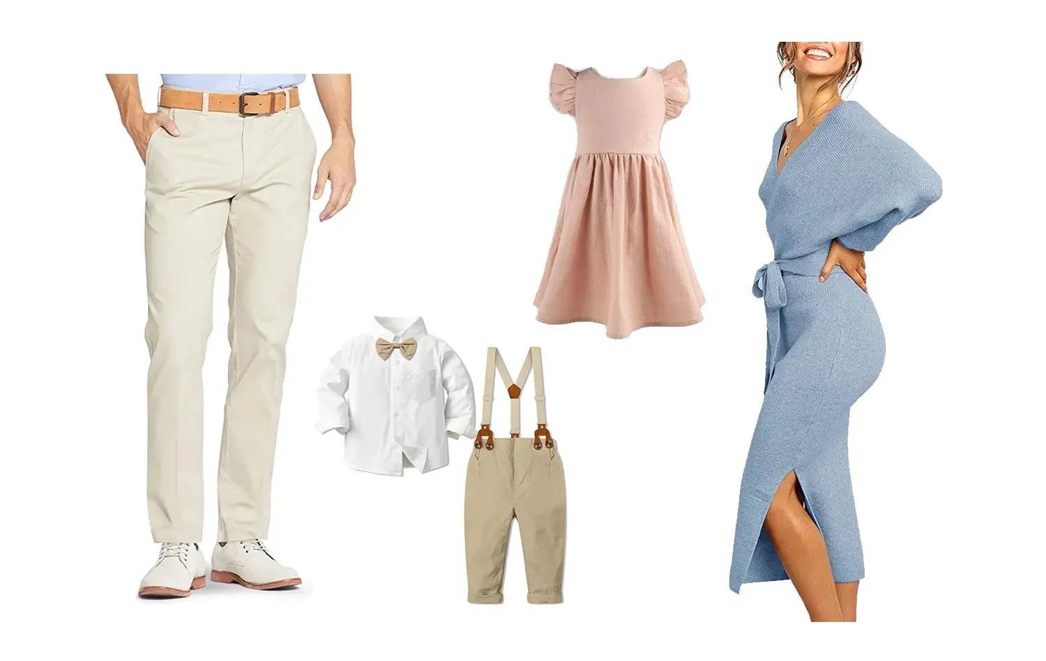
Amazon Links: Men’s Pants | Boy’s Outfit | Girl’s Dress | Woman’s Dress
complimentary colors — light plum & pale canary yellow with creams:
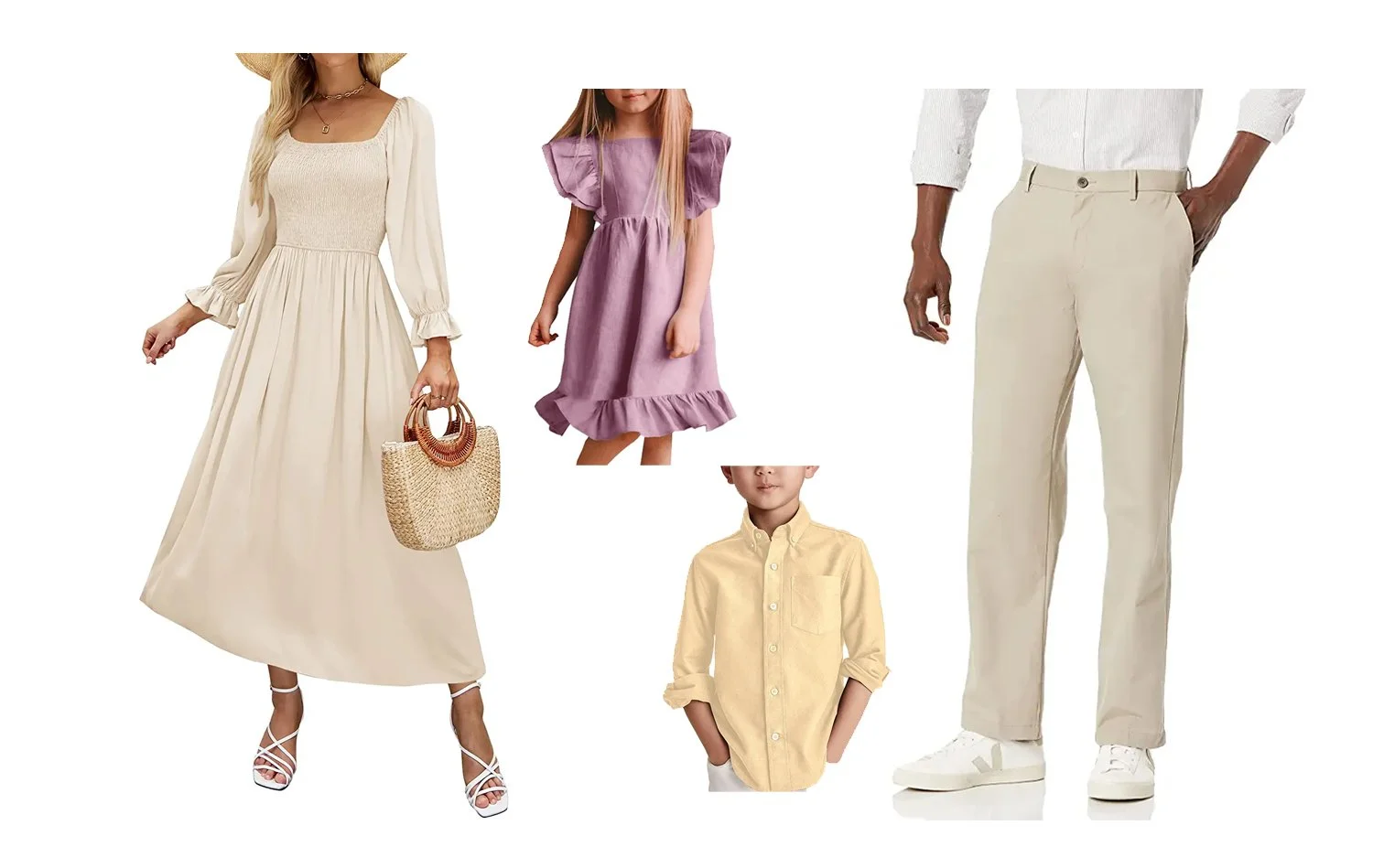
Amazon Links: Women’s Dress | Girl’s Dress | Boy’s Shirt | Men’s Pants
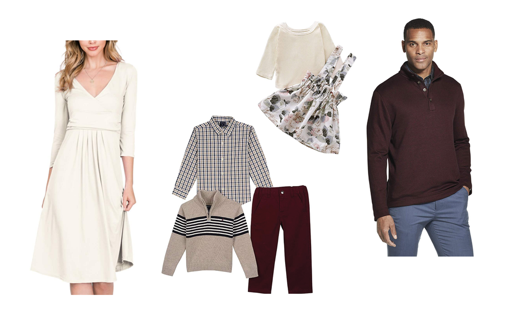
cream or white & light blue:
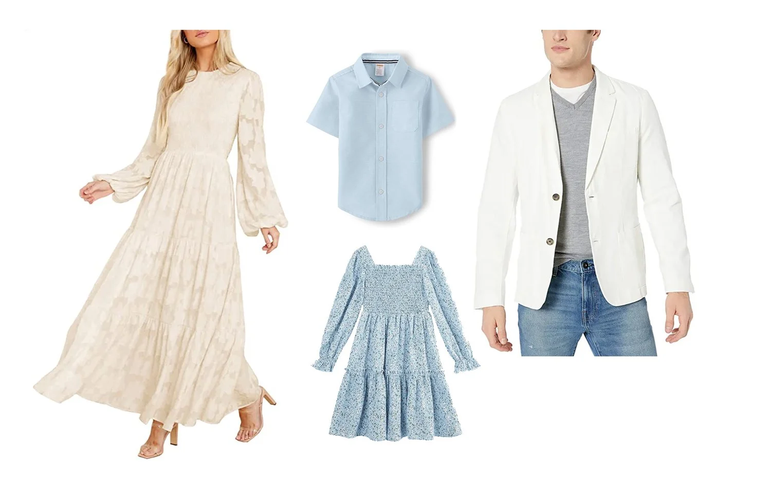
Amazon Links: Women’s Dress | Boy’s Shirt | Girl’s Dress | Men’s Jacket
complimentary colors — sage green & light pink
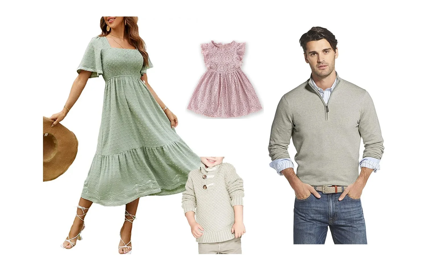
Amazon Links: Women’s Dress | Boy’s Sweater | Girl’s Dress | Men’s Sweater
richer color scheme: reds, jewel tones, brights:
(*again, please try to avoid super bright/neon colors because of the color cast that happens on skin)
Note: These darker pops of color will create slightly heavier photos, so you might want to use them in smaller amounts.
Wardrobe Tips

For the ladies…
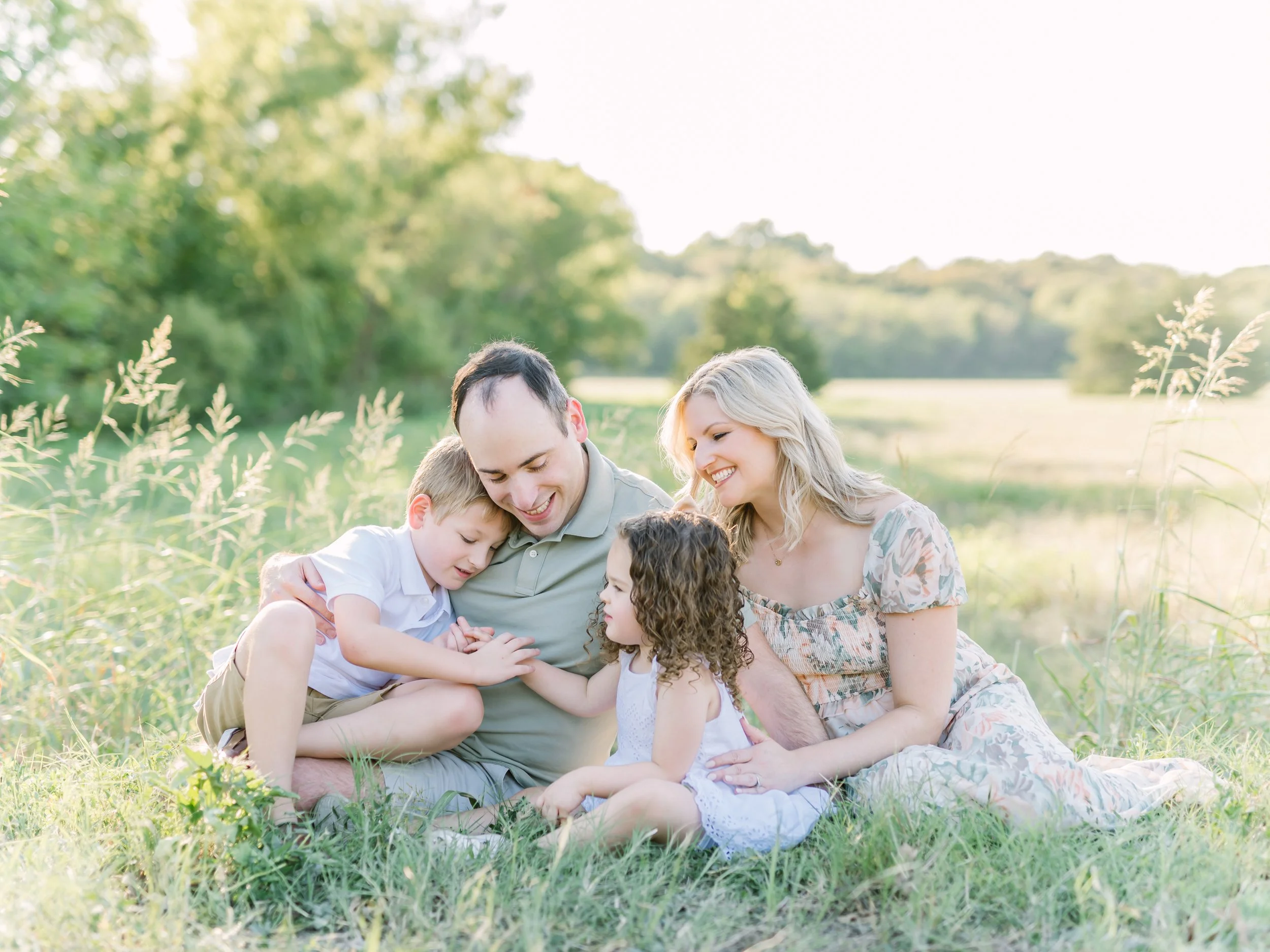
When the ladies wear dresses, it really helps create that timeless look. I highly recommend maxi's for mama's! The floor length flatters, and when a little breeze flutters by it helps create motion in the photo. (psst... wearing dresses is NOT an absolute must, but it really does help create the aesthetic you often see in my work!). If it's cold outside, I recommend bundling up for sure. Don't worry about wearing a dress if it's too cold! Clothing colors matter more than clothing styles at the end of the day.
For little girls, you can go very simple! Just a solid colored, plain dress can be perfect. You can also add texture with sweaters, boots, bows, etc.
For the fellas…
Keep it simple! For the fellas, SIMPLICITY is the best bet! For shirts, I recommend a button-up dress shirt (rolled up to the elbows if the temperatures allow! It helps create a dressy, but not stuffy look). For bottoms I highly recommend keeping them light. This can make a HUGE difference in the photo aesthetic. Khakis, tan pants or light grey will work. If you'd like to go the denim route, make them very light. I discourage dark pants (black, navy, dark brown, etc.) because of the contrast it creates with other light colors. Your eye will go right to it!
*Adding layers and textures by way of blazers, suspenders, vests, etc. is always a good idea as long as the colors stay muted.
QUESTIONS?
I know that this guide is long and hopefully it covers everything you need to know to dress for your session! However if there is something I missed, or you need a recommendation feel free to email me.